Monday, October 4, 2010

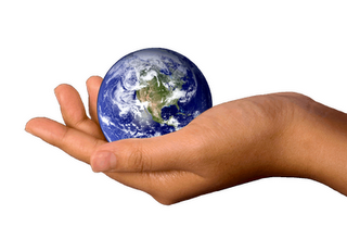
Porportion : Principle of Design

In the first picture the size of the earth is being compared to the hand.
In the second picture the fish is being compared to the fisherman. The pictures show the relationship between one another.

Friday, October 1, 2010

Rhythm : Principle of Design

This picture shows rhythm because it shows the gradation of the shapes and colours.(Arranged by certain shapes or color)

Variety : Principle of Design

This picture shows the different variety of fruits and vegetables and colours. You can see the different fruits and vegetables just by a glance.

Balance : Principle of Design

The Ying Yang symbol represents balance because both sides show symmetry except they are of different shades. The white balances the black and the black balances the white.

Texture : Element of Design

This picture shows the texture because if you were to feel it, you would understand that the surface is rough and just by looking at it, you can see the uneven surface.

Shape

This stop sign shows shape because in safety the order of hazard symbols are triangle, square and hexagon. By using a hexagon it means more than a triangle or square.

Emphasis

In this picture there are many black colored people but there is one that is a bright orange yellow. The picture is an example of emphasis because it is the only different colour.


This is another example of emphasis as the letters "wake up" are bold.